Bary, 2026
Standing up design for an online store built for road carriers
First designer the company ever hired, and sole designer on the product. I led the redesign of Bary’s legacy product into V2, working hand in hand with the PM so the specs and the designs told the same story.
Overview
An online store for road carriers, under their own brand
Alice joined us for a three-month mission. She ended up staying a year, and her work profoundly transformed Bary. For the first time, I am truly proud of my product. For a founder, that’s no small thing.
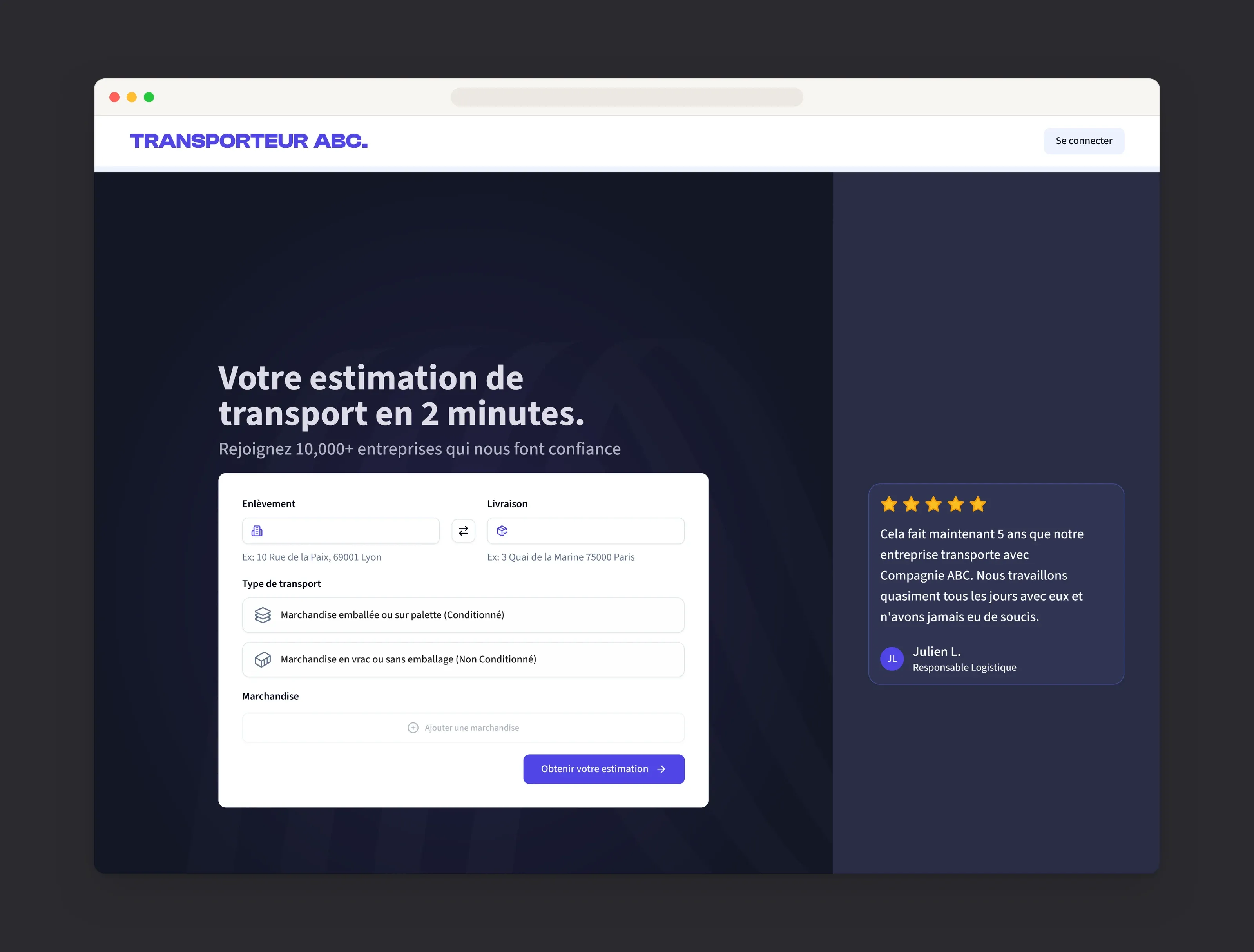
Bary gives road carriers (transporteurs) their own B2B online store, under their brand and at their prices. Their customers, the shippers (chargeurs), get an instant estimate and book a transport in minutes, while carriers run their back-office in it: quotes, pricing, clients, invoicing and transport tracking.
Closing that loop was the north star for V2: a carrier onboards and sets their pricing, and a shipper receives a real quote.
My role
I was the first designer the company ever hired, and the only designer on the product.
Product designer ever hired
The role didn’t exist yet, so I built it, along with the way design works with the rest of the team.End to end
From information architecture to shipped screens, across both the shipper and the carrier sides.Close to the specs
I supported the PM on the specs with flows, edge cases and prototypes, so the intent survived all the way to the build.
Beyond the screens, I introduced a design process, advocated for design with the leadership team, product and developers, worked with Customer Success, Marketing and Sales, and made sure we got close to real users.
The impact
Every tester completed a transport order unassisted in the final round of testing, up from none in the first.
It’s pretty easy. I think even I could do it. It’s very intuitive to use.
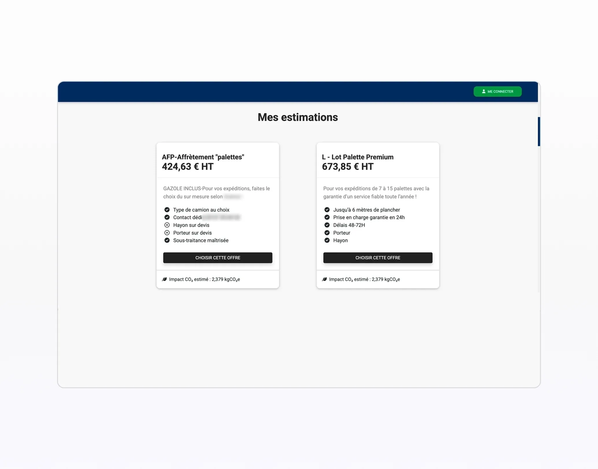
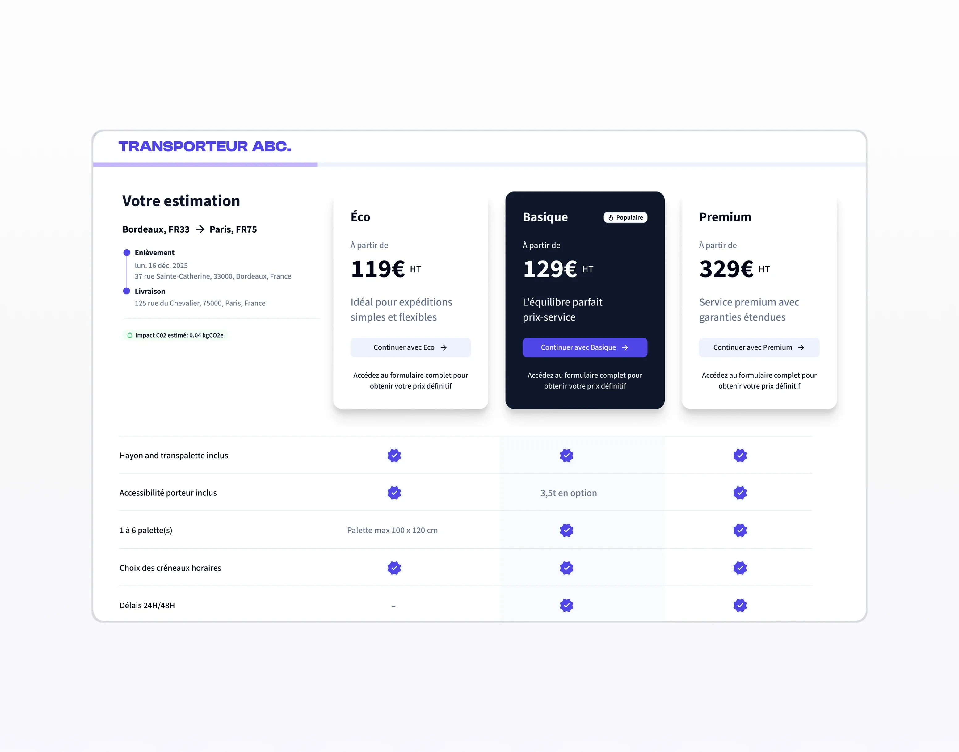
Before and after
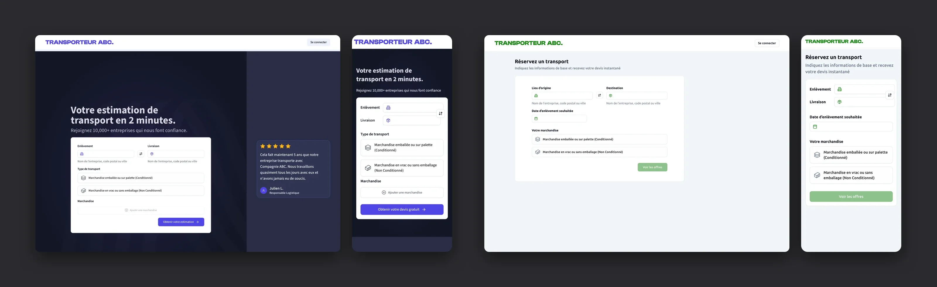
The quote funnel went from a list of offers to a clear, self-serve estimate.

Challenge
A rich, regulated product that needed a design foundation
Bary had grown fast and was ready for someone to own the experience as a whole. A few opportunities stood out.
One home for each object
The same information could appear in several places, so each object needed one clear home.Daily work first
Configuration and daily operations sat side by side, so the work people do every day deserved to come first.Specs and design together
The team shipped fast, so specs and designs needed to move in step to keep the build consistent.
On top of that, French e-invoicing leaves no room for approximation, so the same vocabulary had to hold on every screen.
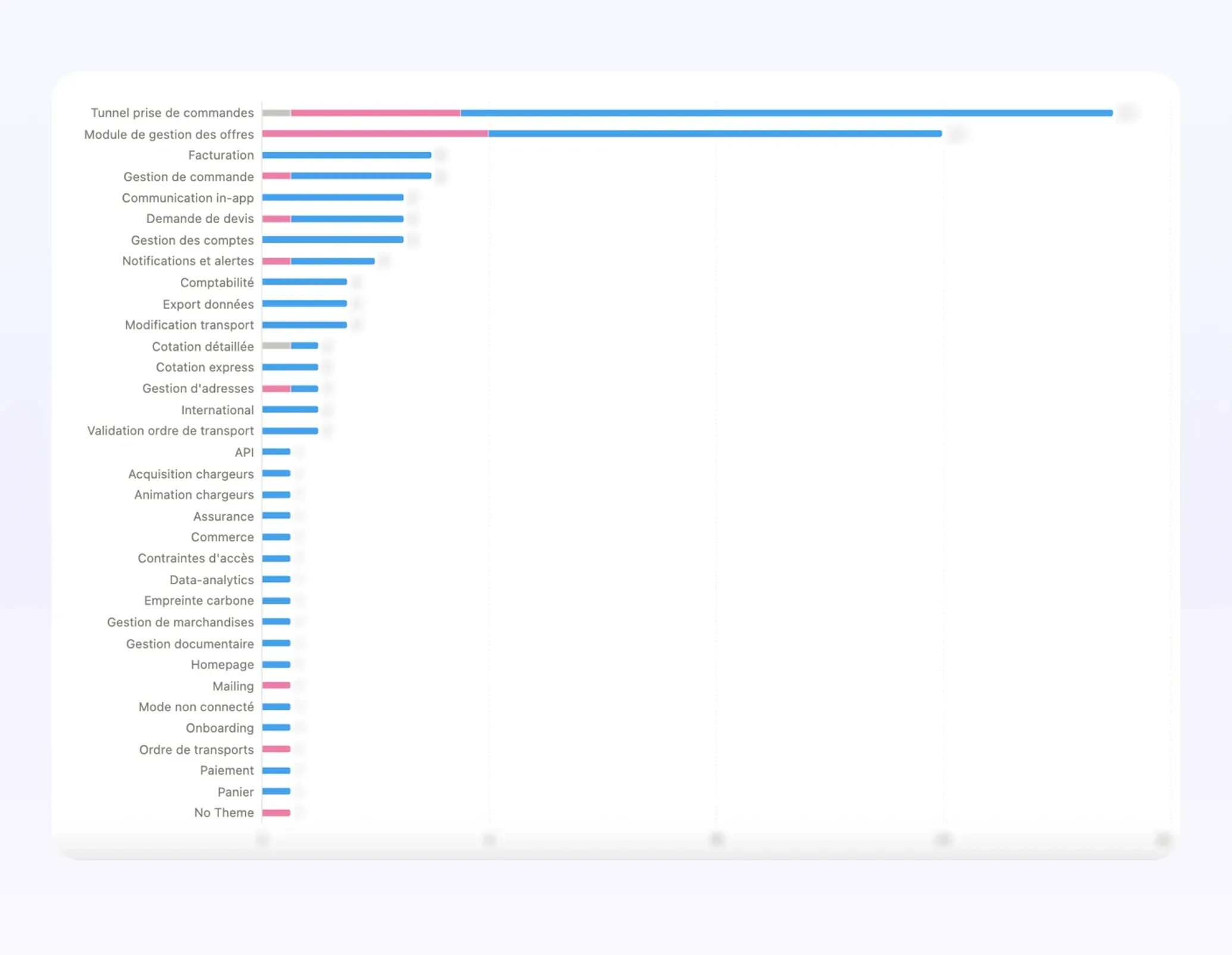
Two themes dominated every user signal: the order funnel and the offers module.
Research
Bringing the founder’s expertise and real users into the product
Discovery
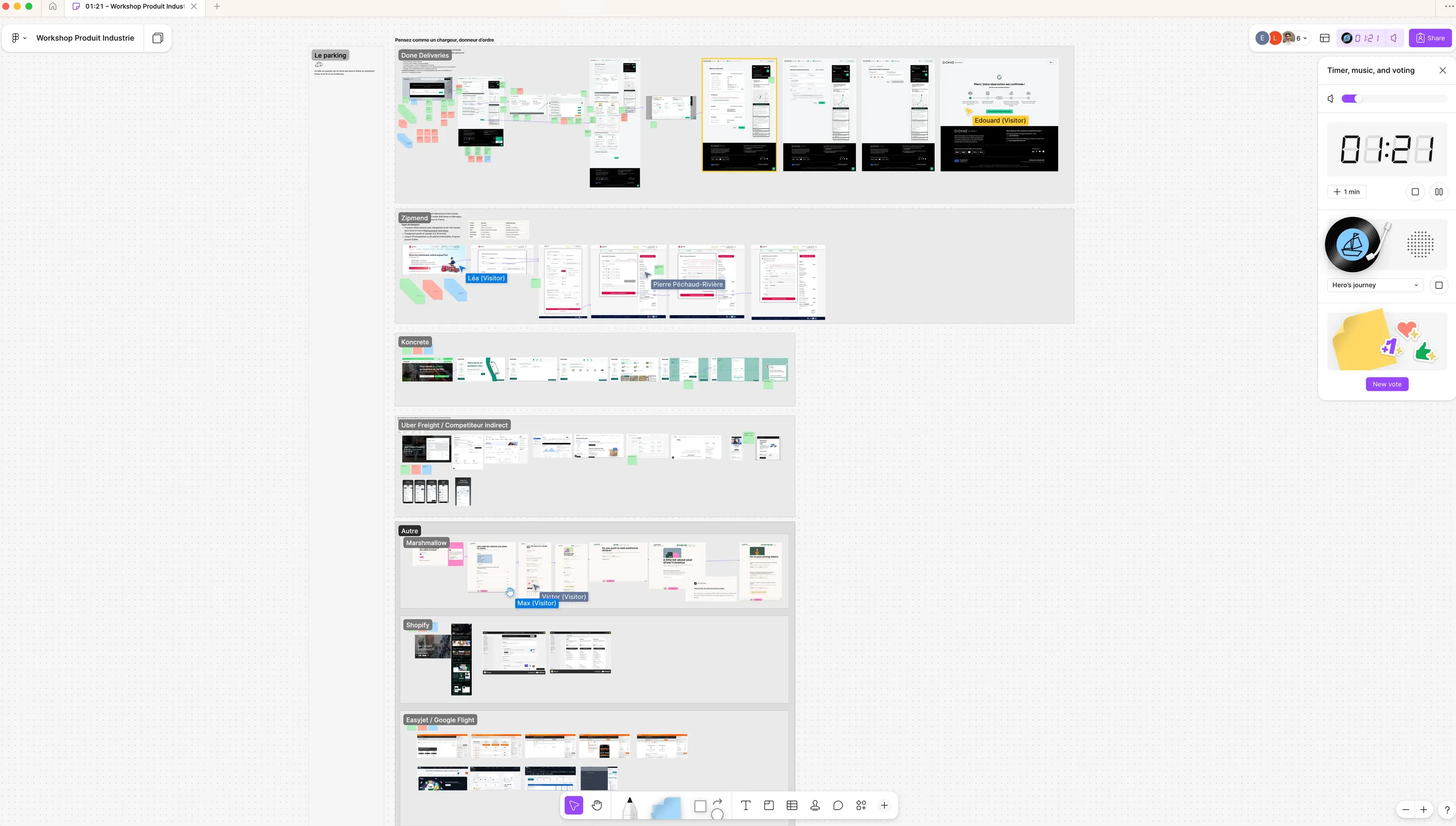
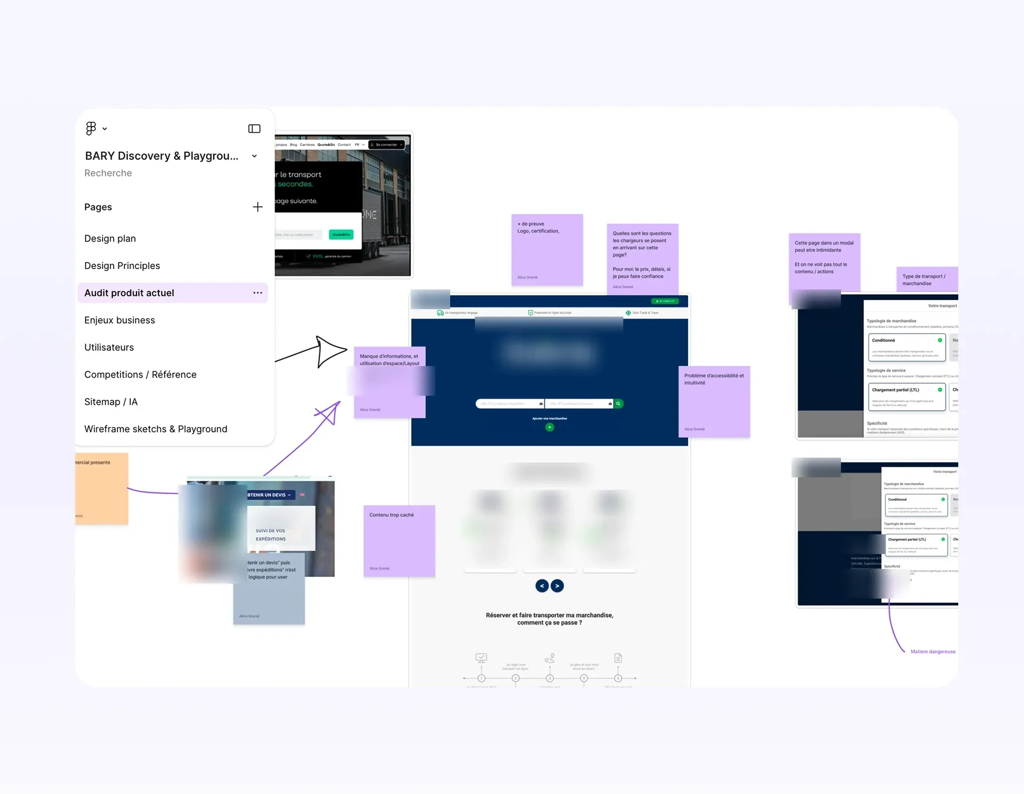
The CEO knows the freight industry inside out, and I wanted that knowledge in the product. So I ran a FigJam workshop with him on a competitor’s booking flow, and audited the existing product surface by surface.
Listening to users
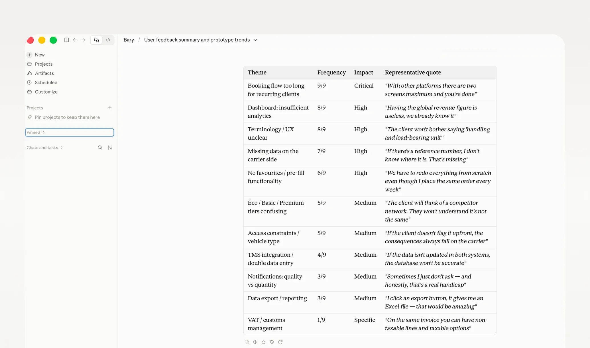
I ran two live interviews and reviewed six recordings of past sessions, then synthesised everything into ranked themes. The signal was blunt: the flow was too long for people who order every week.
With other platforms there are two screens max and you’re done.
Approach
Setting the rules before the screens
The team was building fast, with AI-assisted code generation. My job was to set the invariants once, so that speed didn’t turn into inconsistency.
Rules before screens
One home for every object, navigation shaped by how often people do each task, and a catalogue that never carries price. Guardrails, not style preferences.Design and specs in one loop
The PM’s specs and my designs moved together. When a flow broke, we fixed the rule and the screen at the same time.Direct line, clear phases
A weekly 1:1 with the CEO for direct feedback, and a process shaped as discovery, design, then test.
Information architecture
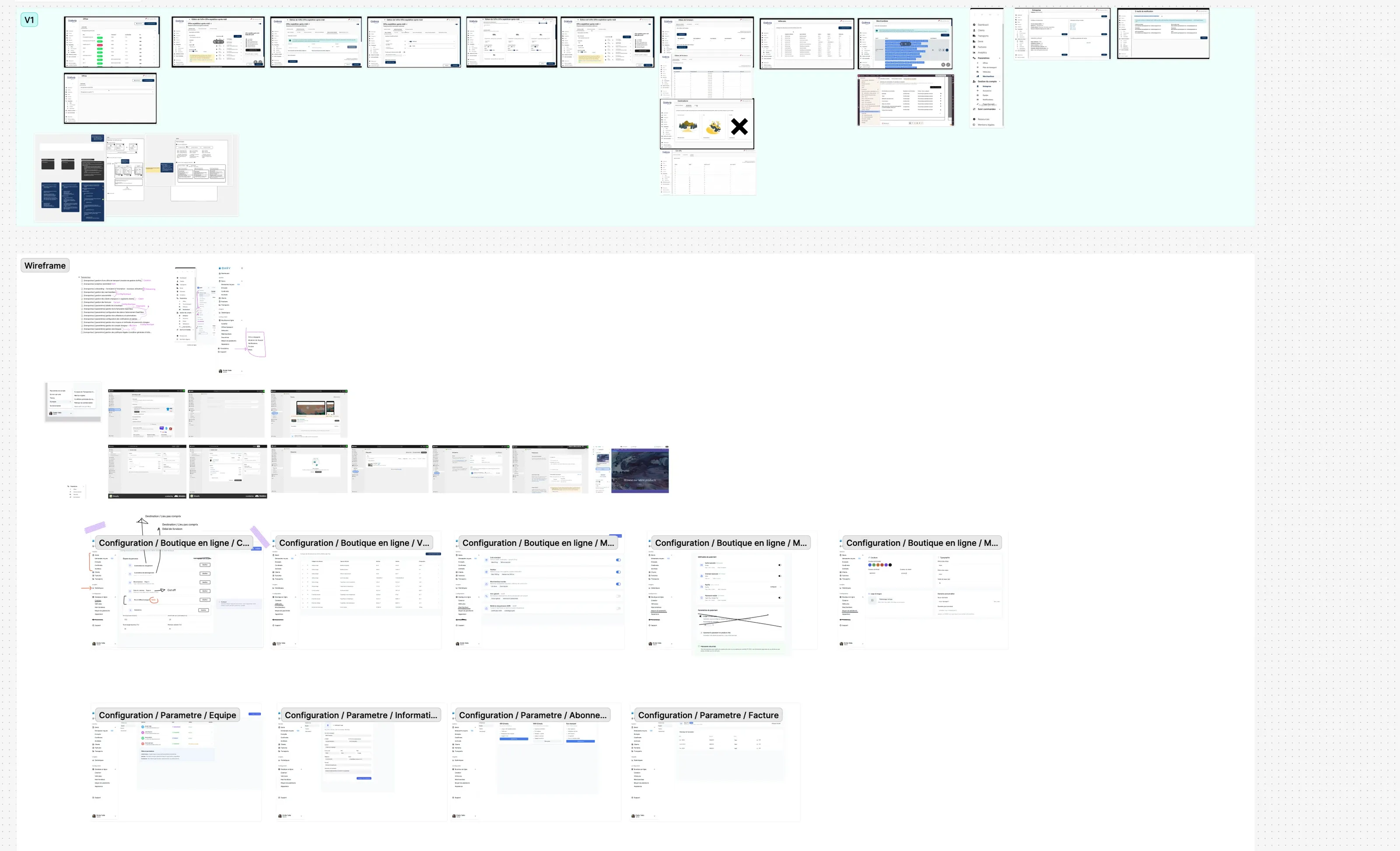
35 low-fidelity wireframes mapped the MVP. Navigation uses nouns only, high-frequency work sits at the top level, and configuration is cleanly separated from daily operations. This is the structure the design system would grow against.
Prototyping with Lovable
I built interactive prototypes in Lovable for two jobs: making concepts real for the CEO, PM and engineers, with something to click rather than describe, and putting actual flows in front of users before a line of production code was written.
Designs
Redesigning the funnel, the system and the back-office
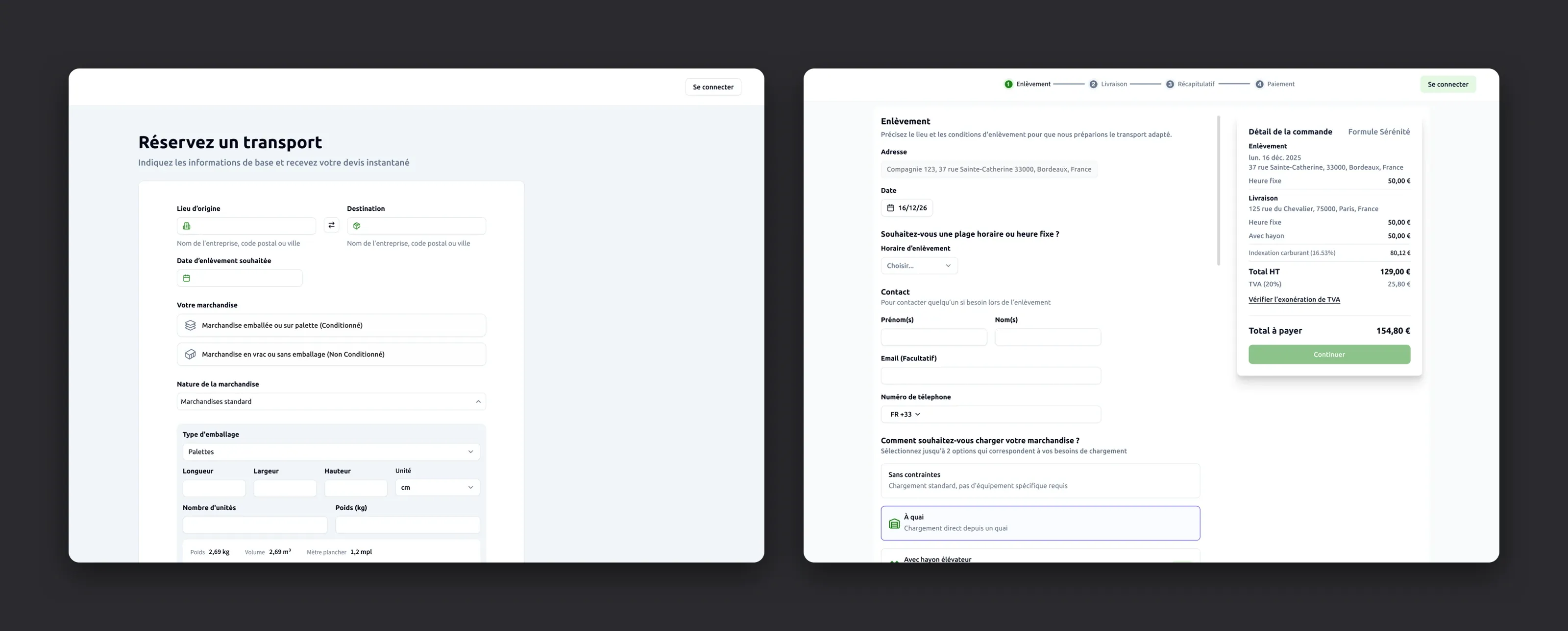
Progressive disclosure, not a locked wizard
The booking flow guides people step by step without trapping them in a rigid sequence.
A soft stepper
It moves forward on its own, yet any step can be reopened at any point.Never asked twice
A strict line between the on-site contact and the person booking, so nobody enters the same thing twice.Why we ask
A side rail explains each request, so dense freight inputs feel safe to fill in.
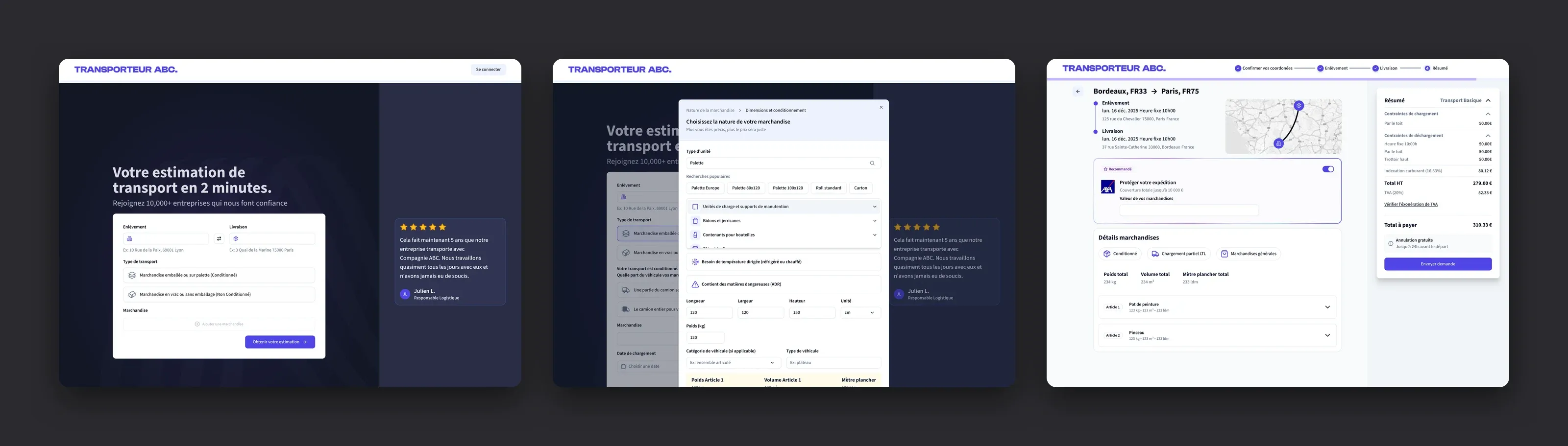
Iterating on the goods modal: a full-screen dark version against a lighter, guided side panel.
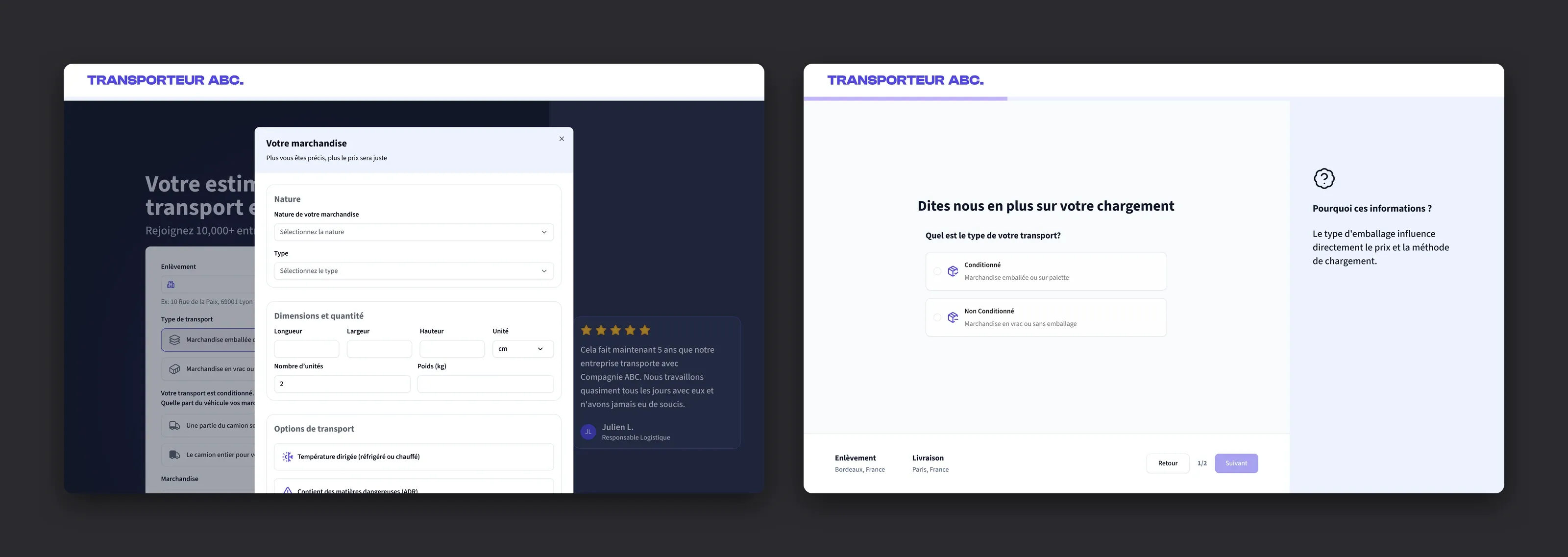
One system, many identities
I didn’t reinvent a component library. I adopted shadcn/ui to move fast, then maintained and extended it, and added multi-brand theming so one platform can wear each carrier’s identity. It’s themeable from a single source and responsive from phone to desktop, which left the time for the hard product problems rather than the basics.
The other half: the carrier back-office
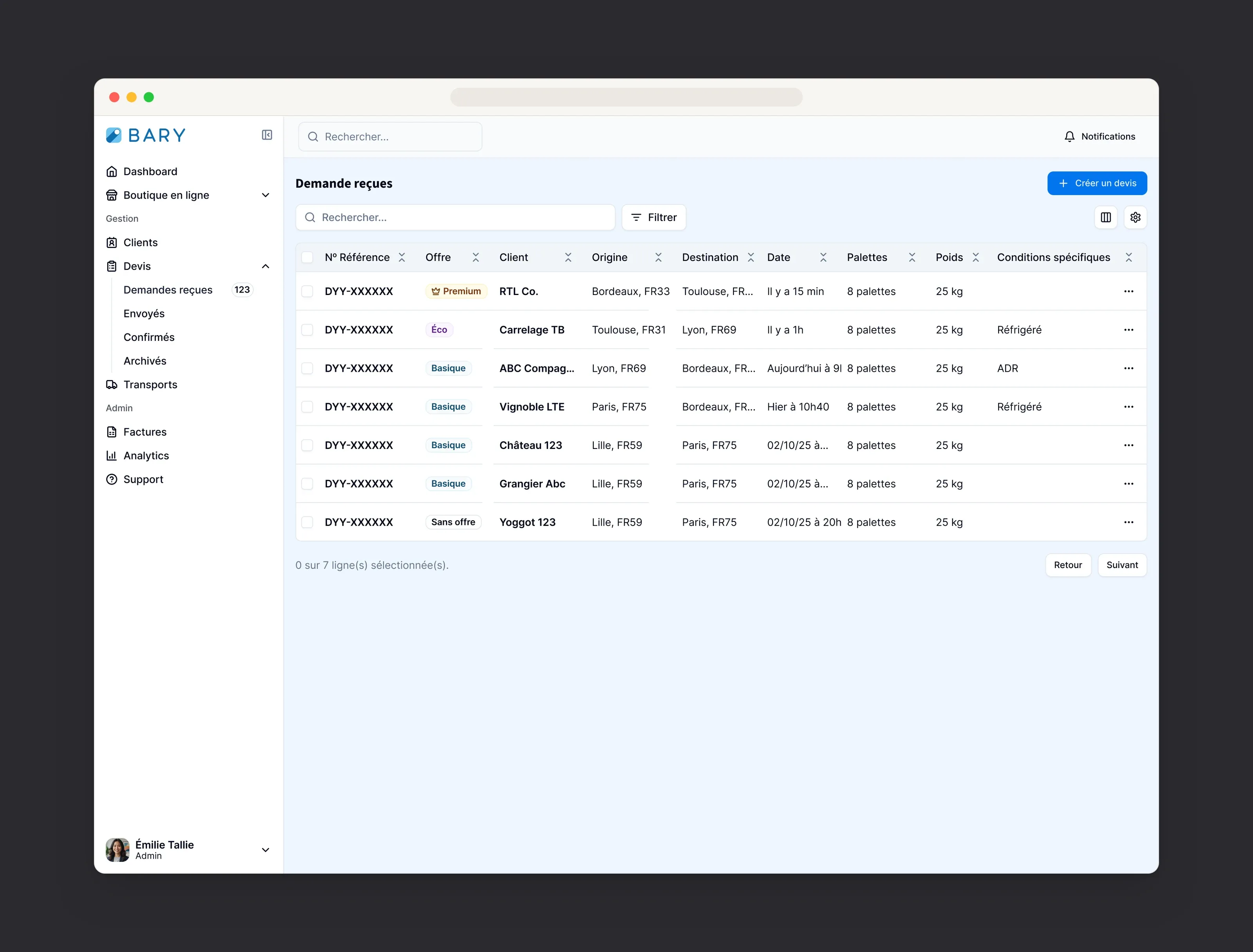
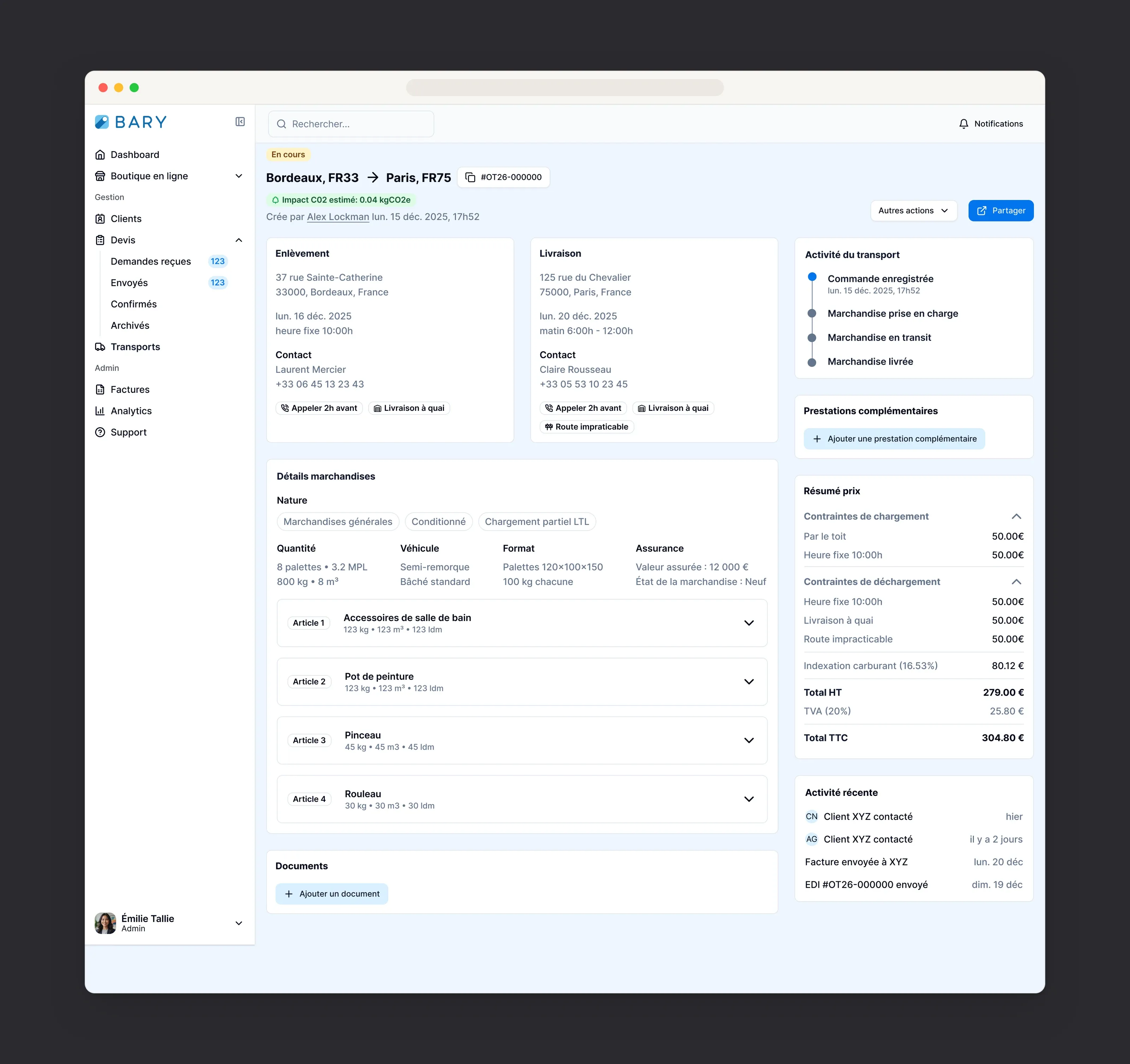
Dense operations, made legible. Incoming quote requests, the lifecycle from quote to invoice, and a transport detail that reads at a glance: the daily surfaces carriers actually live in.
Outcome
A spine the team can scale against
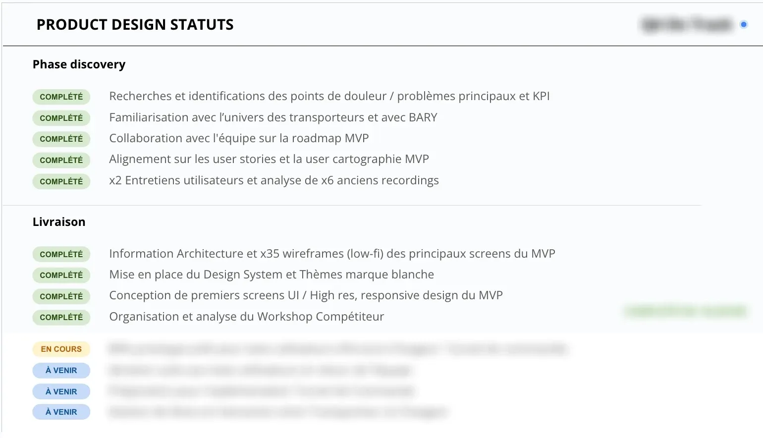
A fast MVP
MVP discovery and delivery completed in a few weeks, with the funnel prototype ready for user testing.
Specs and designs in step
Designs and the PM’s specs moved in lockstep, cutting the ambiguity that used to leak into the code.
Orders completed unassisted
Every tester completed a transport order on their own in the final round, up from none in the first.
A clean handover
I recruited and onboarded the in-house designer who took the product forward.
The real deliverable wasn’t a screen. It was the set of rules that keeps a fast team coherent, and proof that design belonged in the room from day one.